|
How These Charts Were Created
It is not necessary to have a background in computer programming to understand the
manner in which the statistical data for this study was prepared. In order for you
to more fully comprehend the results and the intensity of effort that was involved
in their production, you may wish to familiarize yourself with the methodology.
Here, in step form, is the basic procedure used in our computer analyses of the
Weekly Seasonal Charts:
- Read the daily history file for each market and month for every year on file, i.e.,
June Live Cattle ’67, ’68, ’69, ’70...’07.
- Line them all up by week using Friday as the end of the week.
- If there are 2 or fewer trading days by the first Friday of the month then regard
the week ending that Friday as being part of the previous month.
- Line up last X months of data to end of last pre-delivery month. If we’re
doing the August Live Cattle contract, for example, then stop at the end of July.
- The only exception to this is Sugar. Stop 2 months prior to the expiration
month for Sugar. So if the contract is for July Sugar then the last month of
the chart should be May.
- Normalize the data: Max = highest price; Min = lowest price. All other prices
X = (X – Min) / 100 * (Max – Min).
- Calculate the differences from week to week. Start with a closing price for
the first week. Say that it was 10. If at the end of the next week the
closing price is 11 then the week was a winning week and the gain was +1. Count
up all the winning weeks and all of the losing weeks. (Do not count weeks with
no change.) In the % square at the bottom of the table for each week show the
% winners or the % losers depending on whether there were more winners or losers. In
the square above the % squares show +/- depending on whether there were more winning
years or losing years.
- In the squares above the +/- squares show an arrow if the % value is greater than
60. Show a down arrow for <= -60 and an up arrow for >= +60.
- The trend line is actually the cumulative gain/loss values over all the weeks. If
the close at the end of the first week is 10 then the first plot on the chart is
10. If the gain for week 2 is +1 then the next point on the chart is 11. If
the gain for the next week is -3 then the next point on the line is +8, etc. Given
that the data is already normalized, the charts have a min value of 0 and a max
of 100.
There are other ways in which the data could have been analyzed. If you plan to
replicate this study with your own database, you may wish to experiment with different
techniques of aligning the data, or with different indexing methods.
These Charts Are Not Perfect
No price charts are 100% accurate. We have, however, validated the data, both in
real time and on computer, to test for accuracy. To the best of our knowledge the
data is reliable and reflects the true seasonal situation for each commodity.
Note that the weekly UP and DOWN percentages for
a given contract month are applicable only to that contract month. It is not advised,
for example, that you use the plot for November beans to trade July beans.
Before Using These Charts . . .
Before you use these charts it’s important to understand exactly what they
mean and what they are saying. It is for this reason that we urge you to read the
instructions and explanations provided below prior to using these charts. The main
caveat is that you understand what you’re looking at so that you will not
misuse it by reading too much meaning into this study.
By reading the instructions you can also save yourself a great deal of frustration
and confusion. The old saying “if all else fails, read the instructions”
comes to mind. In this case, read the instructions before all else fails.
How To Read The Seasonal Futures Charts
I’ve provided a sample chart here that indicates the
meaning of each chart item. Some specific uses will be discussed later on. Here
is a general overview of each chart.
PLEASE READ THESE INSTRUCTIONS CAREFULLY. It will save considerable time and frustration
if you read the instructions before attempting to use or understand these charts.
I have already discussed many of the key points. Refer to the sample chart on page
13 as you read these instructions.
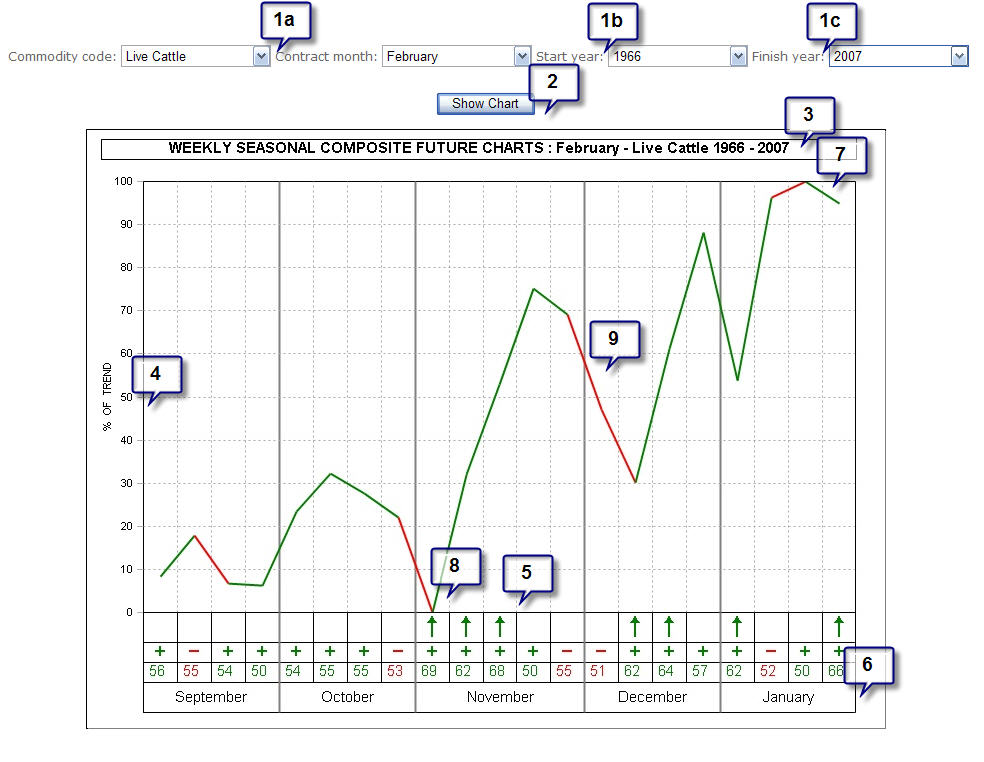
- SETTINGS: To create a new chart specify choose
the parameters for the chart from the list below.
- Commodity code and Contract Month (note that this is slightly different for Spreads
and Stocks.
- Start Year: The first year of data that you want included in the chart (typically
the first year of available data).
- Finish Year: The last year of data that you want factored into the chart (typically
the most recent available year).
- SHOW CHART: Once you’ve chosen your parameters,
click on Show Chart to draw the chart.
- DESCRIPTION: This line lists the details on the
chart type including years covered and the contract, spread or stock which is plotted
below
- % OF TREND: This is the normalized rate of change
index that is used as a reference point. The scale values are not shown, since they
would be essentially meaningless inasmuch as they are of no specific value in using
the seasonal trends, other than to indicate average magnitude of change.
- PERCENTAGE OF YEARS UP/DOWN and ARROWS: These figures
show the WEEKLY percentage of time up or down on a percentage basis, for the specific
week number listed under the percentage reading. If the data plot (see #9) for a
given week is UP from the previous plot, and the reading is +75%, for example, then
this is an indication of upward seasonality. Percentage readings from +60%
to +100% indicate reliable bullish Seasonals and percentage readings from -60% to
-100% indicate reliable bearish Seasonals. Arrows up mark strong periods of bullish
seasonality and arrows down mark periods of bearish seasonality.
Note also the following conditions:
- PLOT IS DOWN and percentage reading is +60% or higher: This means
that the market tends to move UP during this approximate week more years than it
moves down; however, the usual down move is much larger than the net up move, thereby
accounting for the down plot. Upside potential during such weeks may be small in
terms of magnitude although upside moves can be large.
- IF PLOT IS DOWN and percentage reading is -60% or more negative:
This means that the market has moved DOWN 60% or more of the time for this approximate
week during the years examined, and that the size of the decline during down years,
is generally larger than the size of the rally during up years.
- PLOT IS UP and percentage reading is -60% or more negative: This
is an indication that even though most years are down for this approximate week,
during those years that were up, the moves were relatively large. If you sell short
on this type of combination, then you may take a very large risk for a potentially
small, but reliable profit.
- PLOT IS UNCHANGED (SIDEWAYS) from previous week: It is an indication
that the magnitude, or size of the move for this approximate week, is in equal balance
between up and down. This does not necessarily mean a sideways trend for the week.
Trend can only be determined by the accompanying percentage reading. If it is 60%
or more, then you can expect generally higher prices. If it is -60% or more negative
you can expect a down move. The sideways plot means only that the up and down moves
are about equal in size.
- MONTH AND WEEK: We use an ISO standard to determine
the number of weeks in a year and whether a month has 4 weeks or 5. The number
of weeks in any given month, using Friday as the last day of a week, will vary from
year to year. Sometimes November will have 5 Fridays, and other years it will have
4.
The weeks listed are reference points. As mentioned earlier, the last week in the
chart is the last week of the month prior to expiration (for futures contracts). From
this week we simply align all contracts and count “weeks back” from
this final week.
- AVERAGE SEASONAL HIGH is indicated by the highest
plot on the chart. This means that during the years under study, there has been
a tendency for prices to hit their contract high for the given period around this
week and/or month.
If a high is made during the last few weeks of a contract, then prices may move
even higher several months thereafter, and the next contract month should be checked
for this possibility.
If a seasonal high is associated with high readings in the percentage column, and
if a subsequent move to the downside occurs with equally reliable readings, then
this is most likely a highly reliable seasonal top.
- AVERAGE SEASONAL LOW: The same holds true for seasonal
low, only in reverse.
- PLOT: The major plot line shows the seasonal tendency
for all years included in the chart. The green and red sections indicate whether
the weekly price action tended to be positive (green) or negative (red) for the
given week.
Some Additional Details
You must remember that these charts are composites, or a combination of many years
of prices. As such, extreme highs and extreme lows during the same period of time
in different years tend to balance each other out. The net result will be a relatively
even line on the seasonal chart.
This is valuable information since it shows us that the market is not seasonal at
given times of the year. We can then reasonably assume that the existing trend will
be the single most reliable factor as opposed to seasonality. We can also assume
that once a trend starts it should continue. It is best not to rely on Seasonals
when this occurs.
Note also that relative highs and lows within the composite chart are not necessarily
repeated in any actual year’s market. Some years may look exactly like the
seasonal composite charts and others may not. A low may or may not occur at a given
time period. But this does not mean that the seasonal chart is not valid. In using
these charts there are several things you should look for.
- VERY STRONG UP OR DOWN WEEKS. By “very strong” we mean
reliabilities in excess of 70% over 10 years or more.
- DURING LONG TERM UP OR DOWN TRENDS Seasonals consistent with the
existing trend should perform well.
- SEASONAL HIGHS AND LOWS can be estimated by reference to the chart
and in accordance with the guidelines outlined previously.
- CONTRA-SEASONAL MOVES in the actual market can be spotted. If a
particular market shows highly reliable seasonality on the composite, and if this
pattern fails to appear in the actual market for any given year, then a further
move in the contra-seasonal direction can be expected. This is perhaps one of the
most important uses of a seasonal chart.
- MARKET TURNS can be expected at certain times of the year. If the
market is moving down, and the seasonal chart shows a very high percentage reliability
down move followed by a large up move reliability, then one should be on the lookout
for a trend change in the market.
There are many other uses of this information. Applications are limited perhaps
only by the imagination and resourcefulness of the trader. In general, it is best
used in conjunction with trading systems, technical or fundamental.
High Reliability Weekly Runs
Many of the seasonal composites show a several week span of high reliability percentage
readings. We call such periods “seasonal runs”. They are typically a
good period of time for high probability seasonal trends. An example of such a seasonal
run might be as follows: (weekly readings), 69%, 75%, 68%, 45%, 78%, 69%, 50%, 33%,
and 79%.
This is a very strong seasonal up trend which is interrupted only by a few low reliability
readings. The longer term trader might establish and hold a position through this
seasonal uptrend. Watch for these runs. They often pinpoint the most reliable seasonal
moves.
Seasonal price patterns are by no means the only reliable market cycles. At major
long term tops and bottoms seasonal cycles may be distorted. If you are aware of
the long cyclical term patterns within which Seasonals function, you can be prepared
well in advance for a period of time during which Seasonals may become unreliable.
You must remember, above all, that when one extracts a part from the whole, an unnatural
distortion of the original data may result. Consequently, when the analysis is over,
and we have gleaned the necessary information, the part must be replaced within
the whole.
A total picture is necessary in the formulation of any long-range decision. A student
of Seasonals should also strive to be a student of cycles.
Limit Your Losses Regardless Of What The Seasonals Say!
One of the worst errors a trader can make is to become totally dependent upon a
method or technique. We do not, as yet, have seasonal trading tools that are totally
reliable. I urge you to use good sense when making trades. Use stop losses; limit
risk.
|